Ticketmaster has been in the process of moving off of a legacy platform and on to a newer commerce API. With this movement to the new API, the opportunity to build a more streamlined and efficient checkout experience presented itself.
COMPETITIVE ANALYSIs / research
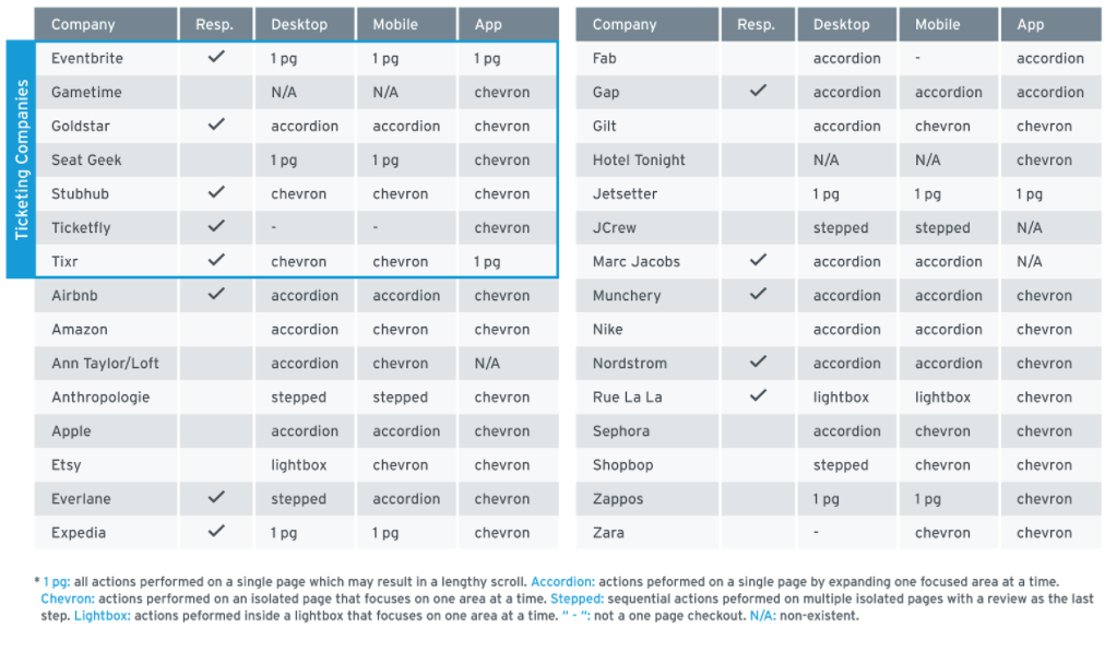
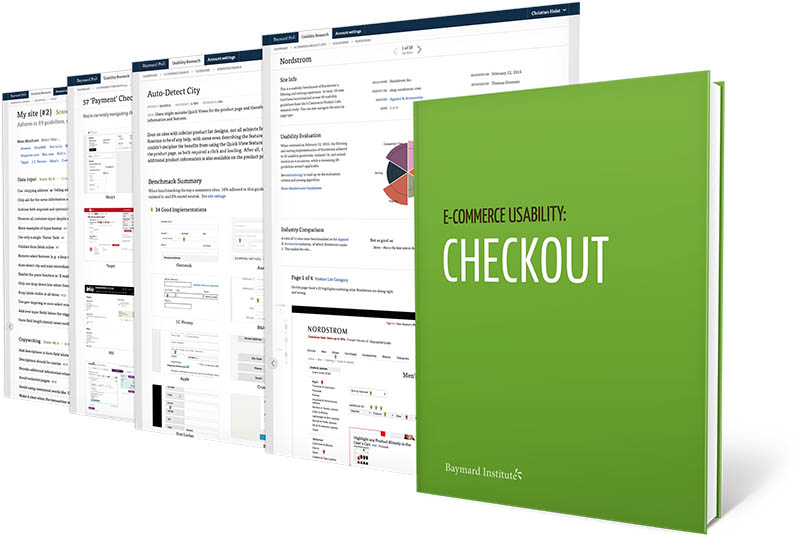
To properly gauge Ticketmaster's place in the market we conducted competitive analysis, examined various interaction models, and studied best in class eCommerce checkouts. Additionally, we referenced the Baymard Institute's guide to eCommerce checkout usability to validate that our design and UX choices would be sound and in line with best practices.

wireframes & user testing
In addition to conducting a competitive analysis, we looked at user feedback of the current checkout flow, A/B test results, conversion metrics, and call center data. With this information, I created a series of wireframes and conducted user tests with paper prototypes to validate usability before proceeding to high fidelity mocks inVision.


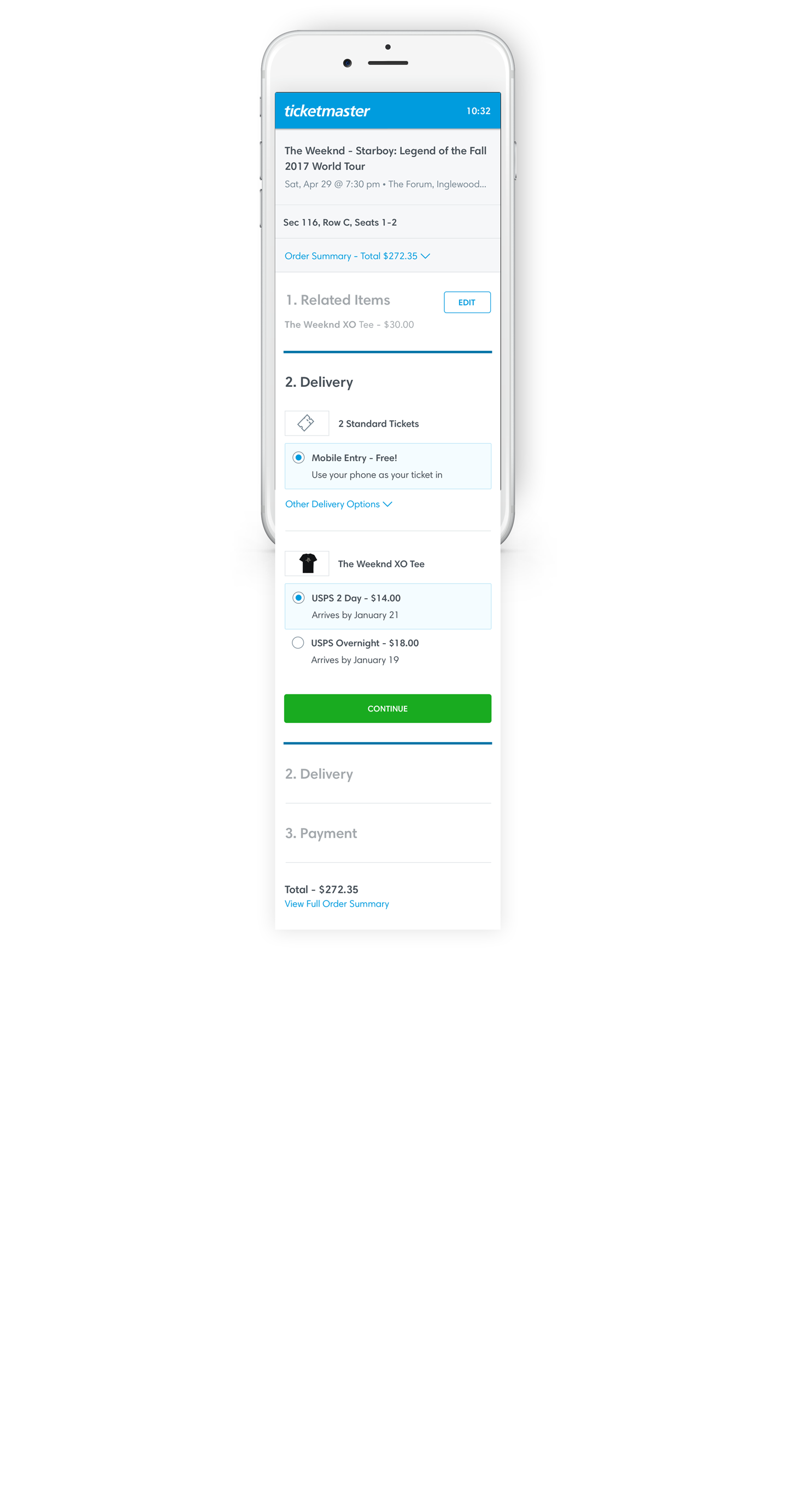
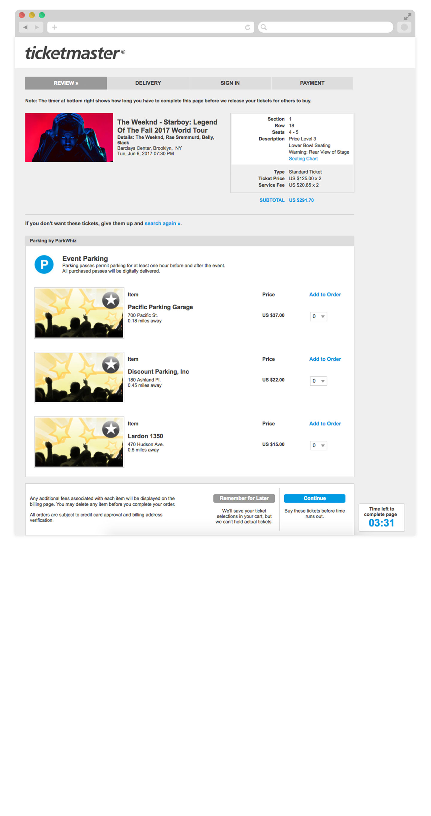
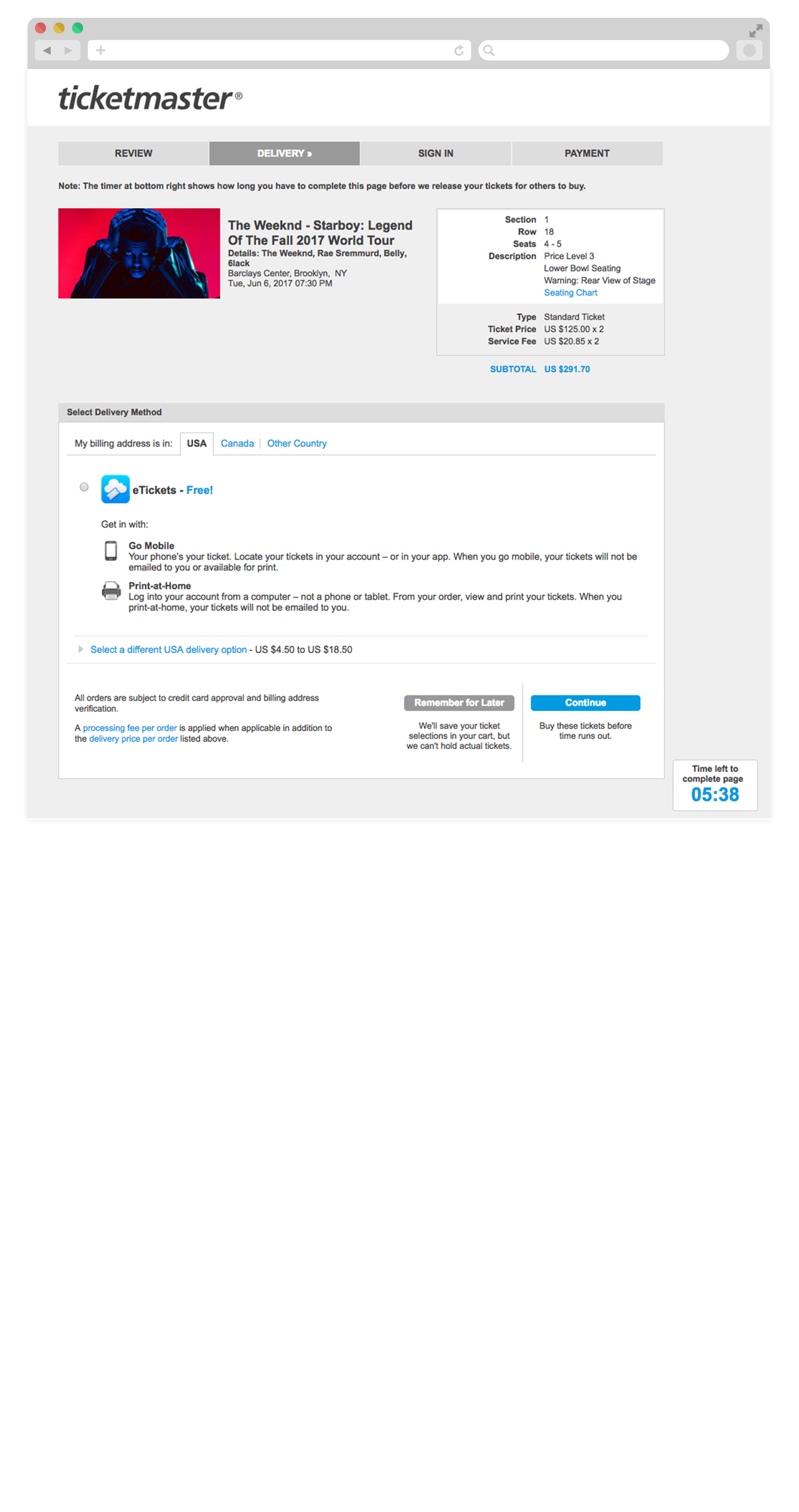
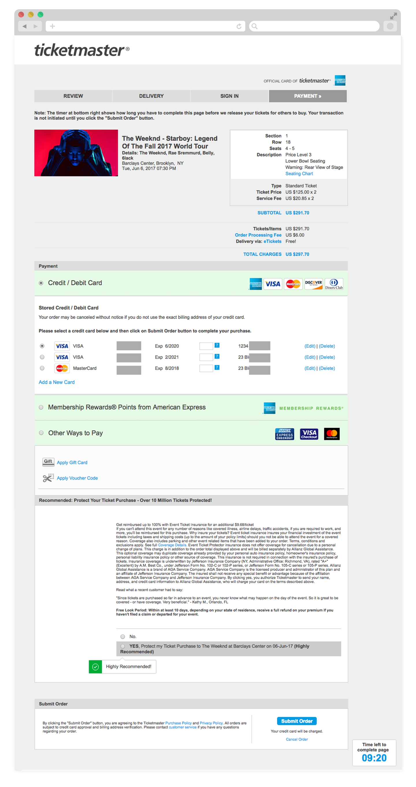
BEFORE
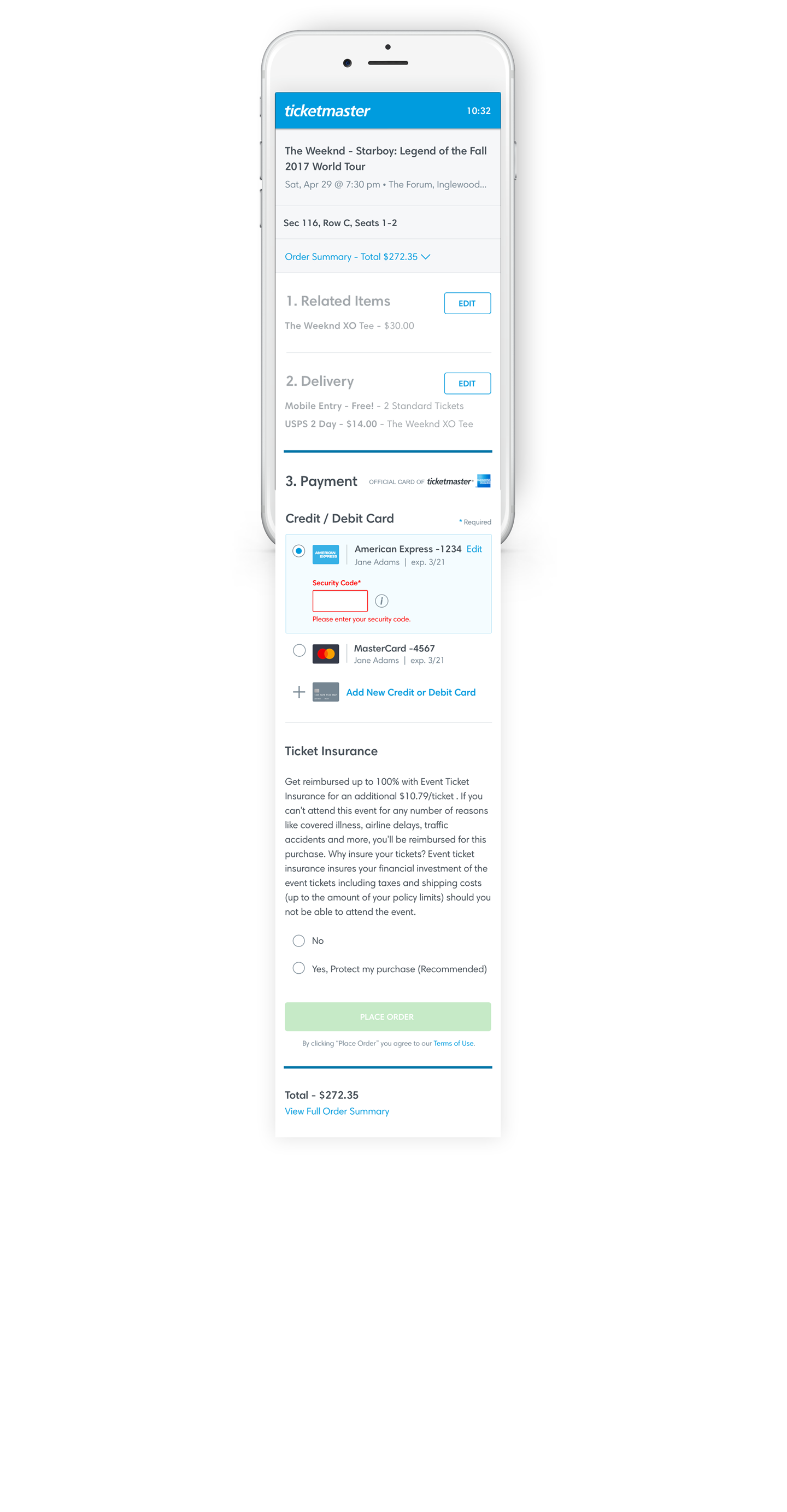
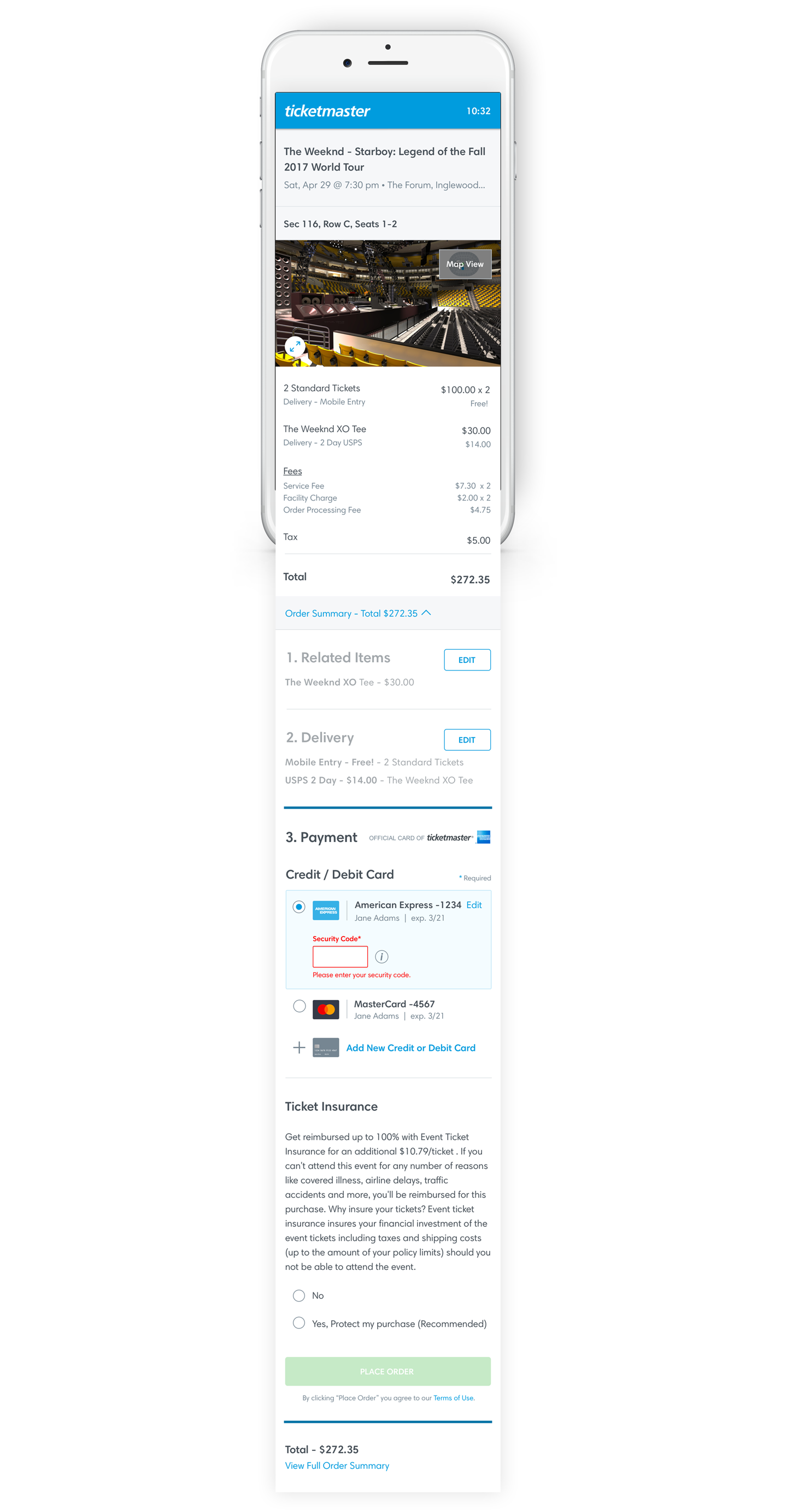
After
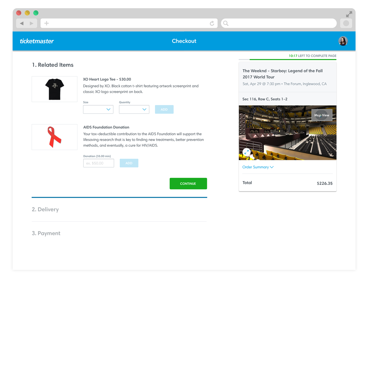
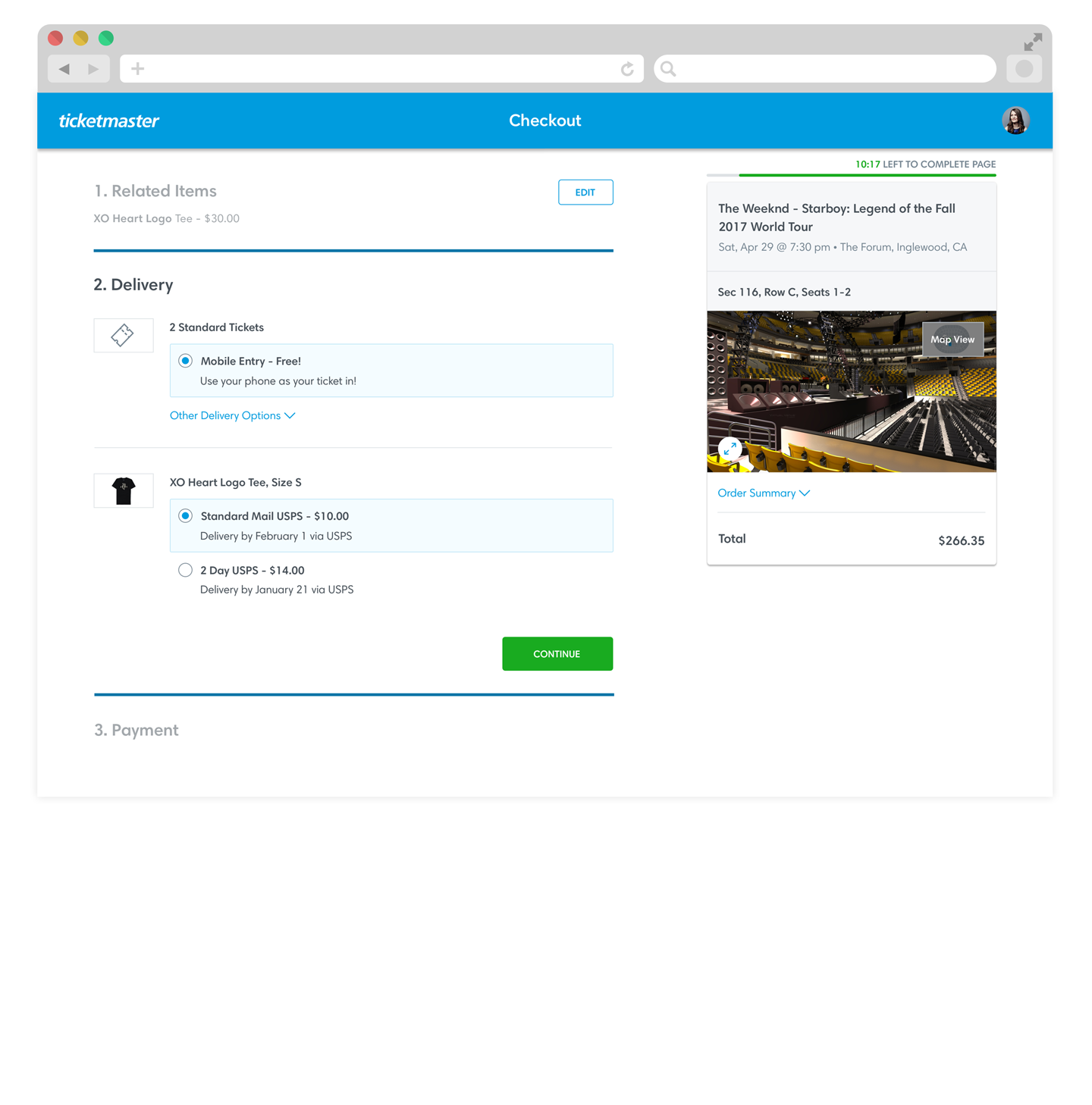
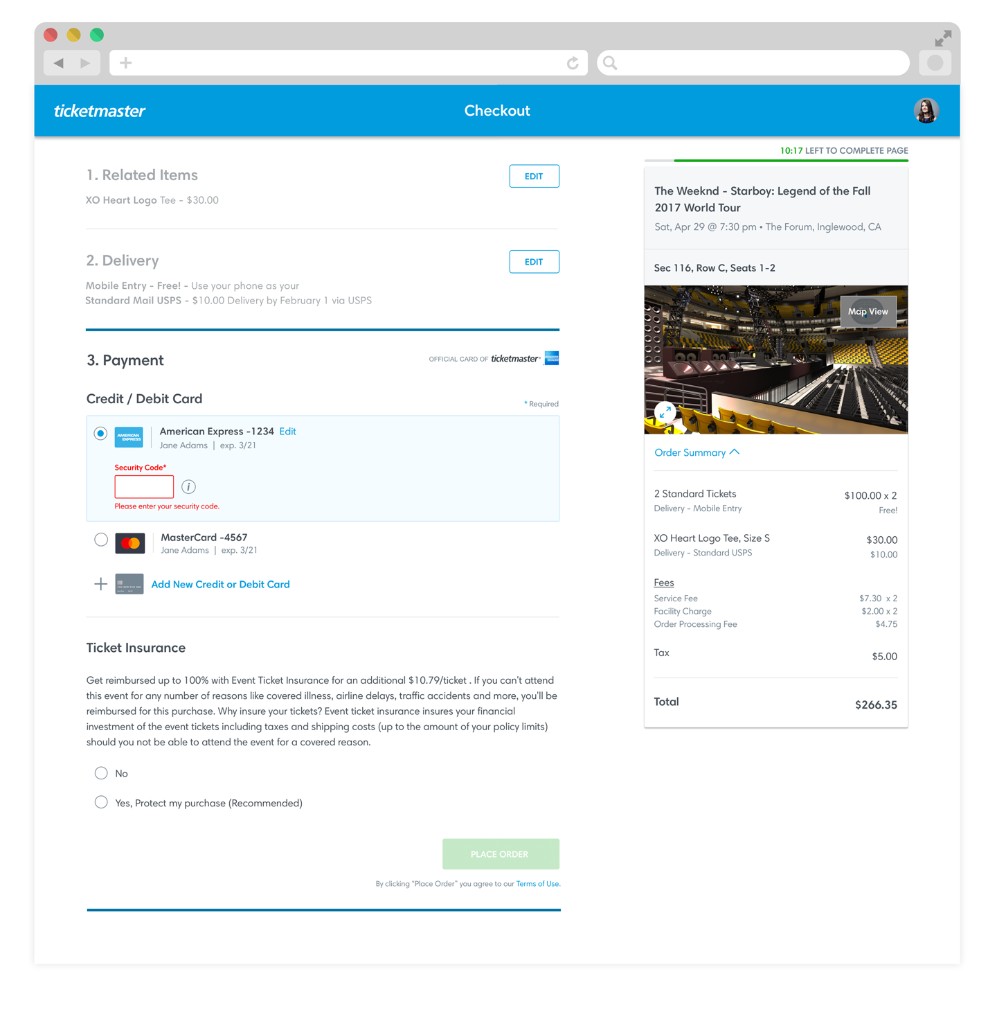
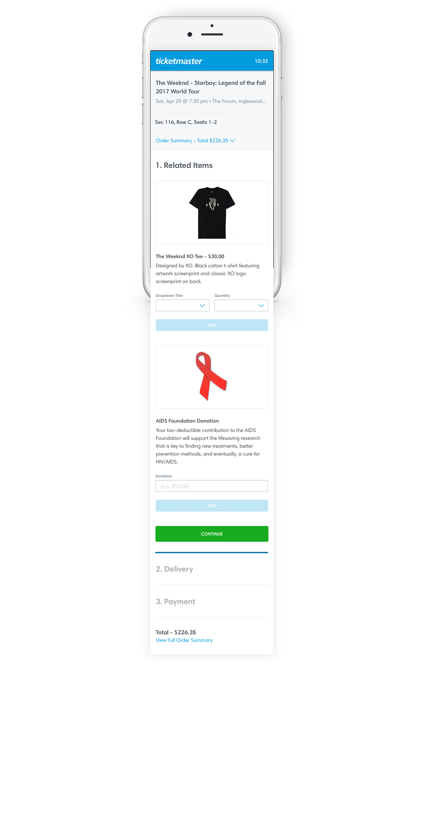
Based on user testing results and Ticketmaster's business needs - I opted to design a one-page, responsive, accordion-style checkout. The stepped approach gives focus to the section at hand, while making the sections editable avoids use of the back button and potentially losing tickets.